| Our new logo |
![]()
| Our new logo |
![]()
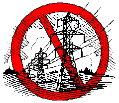
| Sharp-eyed visitors may have noticed that the CARE logo on this page and elsewhere on this site is different from the one you have seen here before. The previous version used a drawing of a metal lattice tower (as below) typifying most people's idea of a power line. |
 |
| One of our members pointed out that the FirstEnergy proposal states the proposed line would be "... primarily supported on horizontal post insulators mounted on single wood poles ... ."
Consequently, in the interest of fairness and accuracy, CARE has revised its logo to reflect FirstEnergy's proposed construction. |
![]()